Charity Bears
Sample Project: Creating a Native Mobile App and Website for my Google UX Design Certificate
THE PROBLEM
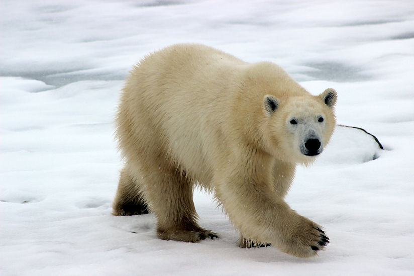
Polar bears are cute, cuddly and down-right adorable. However, they are an endangered species of bear and they need our help in order to survive. People need an app where they can learn more about polar bears and make a donation easily.
MAKE OF THE TEAM
Me
KEY GOAL
Design a way to help conserve polar bears
MY ROLE
UX/UI Designer
UX Reseracher
UNDERSTANDING THE USER
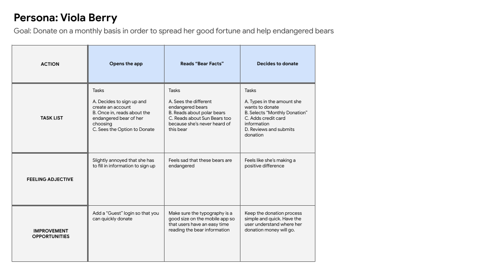
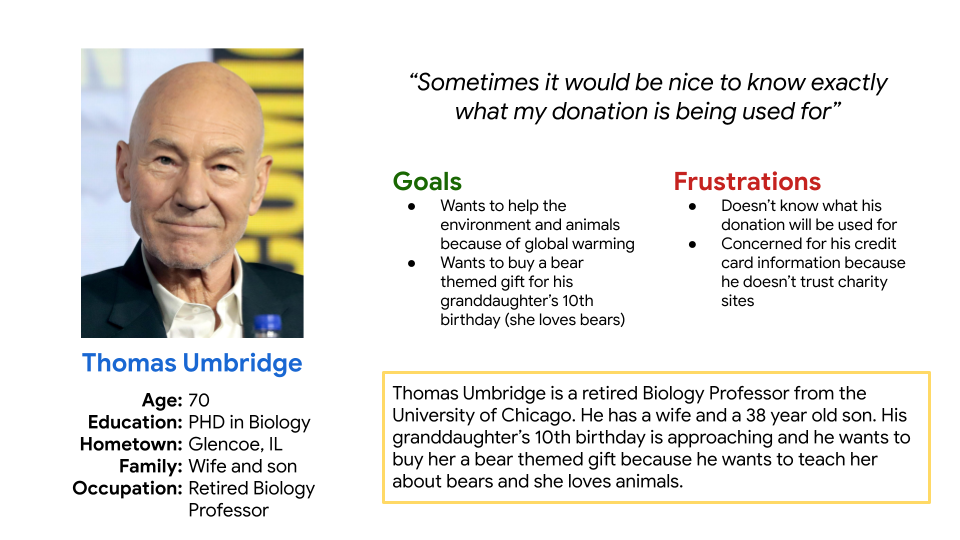
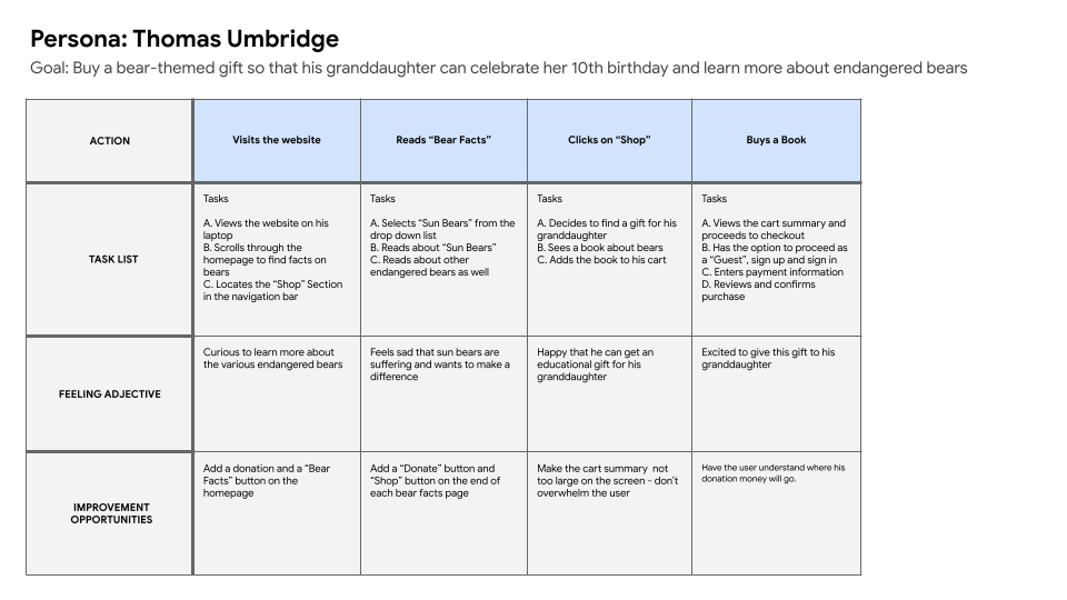
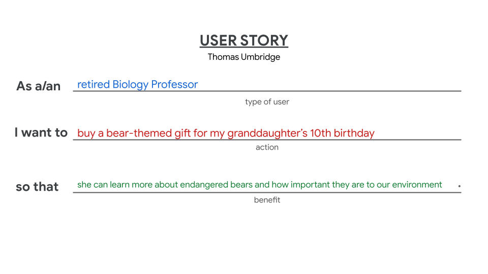
My users were people who like polar bears. I created a Google Form and discovered that 46.6% of users were interested to learn more about Polar Bears than any other endangered bear. My survey results indicated that users want to be able to donate quickly and they want to know what their donation will be used for. My research led me to create user personas, user journey maps, competitive audit and a sitemap.


TITLE OF THE CALLOUT BLOCK
THE SOLUTION
I created a native mobile app and website where people can quickly and easily donate money to help polar bears. Buy purchasing a polar bear book or mug, people will be helping polar bears as well because all proceeds go into conserving polar bears. People can also read facts about endangered polar bears if they want.
BREAKING DOWN THE PROCESS
After my research, I designed wireframes, a lo-fi prototype, mockups and a hi-fi prototype. I also conducted a usability test.
After I created wireframes and a lo-fi prototype for the native mobile app, I organized a research plan and conducted a usability test with 5 females between the ages of 23 - 57. My usability test showed me that users had trouble with the donation process and the navigation of the app. With all of this feedback, I got to work on updating my lo-fi prototype.
Since I picked Polar Bears, I wanted the colors to reflect ice and and snow, which is why I picked different shades of blue and white. I made sure that these colors were accessible. Bears are round, cute and cuddly so the typeface had to be round and soft. Straight and rigid font would make the site feel too harsh and that’s not the vibe I was going for. Within Figma, I created the Charity Bears logo and wanted the logo to be fun and cute because that's what people love about Polar Bears - their cuteness.


THESE WERE SOME MAJOR LEARNINGS OR POINTS I WANTED TO CALL OUT
Narrow Down Ideas
At first, I wanted this project to be about 5 endangered species of bears. However, I realized that I was getting lost in terms of the visual design since 5 different bears look so different and live in different environments. By narrowing down the species of bear to be just Polar Bears, I gained a better grasp on this project and felt more focused. I realized it's very important to narrow down ideas and focus on one idea in order to be successful.
Logo
I took a risk in trying to draw a Polar Bear for my logo. This could have looked really terrible, but I'm happy with my logo design. I like to create my own logos because I enjoy flexing my creative skills and learning how to use color more efficiently.