THE PROBLEM
The bistro has no option for customers to place an online order. Since the bistro's customers are primarily seniors, I wanted to help the business by attracting new customers and improve the bistro's sales.
MAKE OF THE TEAM
Me
KEY GOAL
Design an online ordering website to attract new customers
MY ROLE
UX/UI Designer
UX Researcher
TITLE OF THE CALLOUT BLOCK
THE SOLUTION
I designed the online ordering site, and the owner and manager were both pleased with the hi-fi prototype. However, due to budgetary constraints, the owner decided to hold off on implementing this new online ordering site.
UNDERSTANDING THE USER
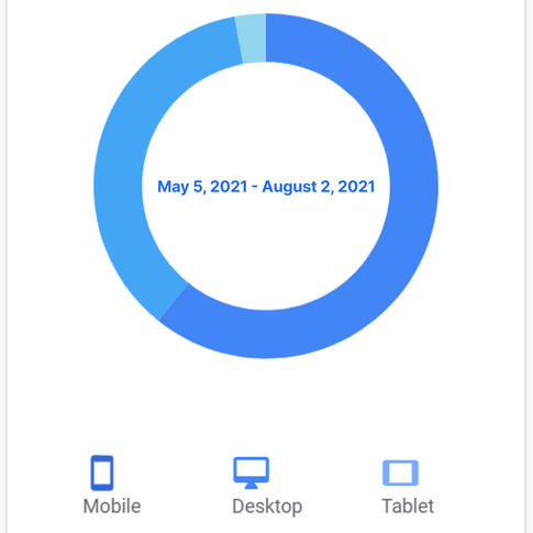
I decided to create a responsive online ordering website because 57.1% of users from the survey indicated that they visit a restaurant’s website to order food. In addition, the bistro's Google Analytics data shows that the bistro's top device is a mobile device (users do view the website on their desktop as well). Having users downloading an app is just an extra step that they won't complete.
BREAKING DOWN THE PROCESS
I created a sitemap, user flow, and sketched a paper wireframe. Afterwards, I designed a lo-fi prototype and conducted 2 unmoderated usability tests using Useberry and Maze before creating the hi-fi prototypes.
Before jumping into the desktop lo-fi prototype, I wanted to conduct an unmoderated usability test to fix any issues before proceeding. I used Useberry and Maze to conduct 2 unmoderated usability tests for my mobile lo-fi prototype.
TEST 1 (Useberry): I created my mobile lo-fi prototype and I sent out the Useberry link on LinkedIn to collect responses.
My usability test results indicated that the users had the most trouble with:
-
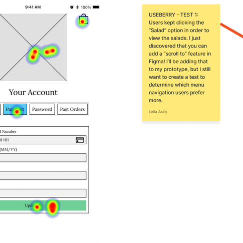
Task 2: Go to your profile, add your payment details, click "Update" and then click the logo to return to the menu screen.
-
When users were on the Account page, they kept clicking the Profile Icon to go back instead of the logo, so I decided to replace that icon with a back arrow.
-
One user mentioned that there was no hamburger menu so I decided to add a side bar menu in order to help users navigate and use the site more easily.
-
-
Task 3: Add a salad menu item to your bag
-
“Scrolling up and down on menus would get stuck was hard to swipe back up because the pictures of each food menu eg. Salads would get in the way of scrolling. I skipped the task cause it was so annoying.”
-
43% of users said that finding the salad menu item was easy while 58% said it was complicated (7 total participants).
-
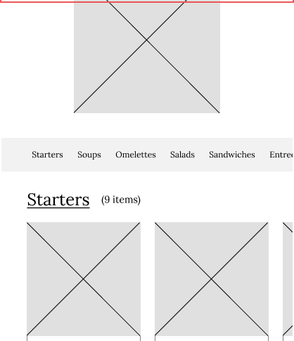
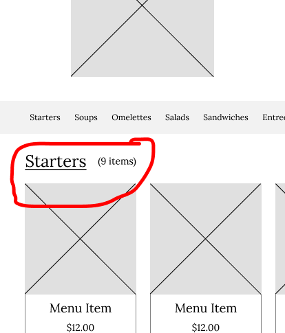
TEST 2 (Maze): Since users had trouble scrolling and selecting a salad menu item, I decided to create another usability test to determine, which menu navigation users liked more. I wanted to see if users liked Menu Version 1 (the original way) or Menu Version 2 (new way) more. I decided to use Maze instead of Useberry because I wanted to try out a new program. Just like before, I sent out my Maze link on LinkedIn.
I asked users to "Add a salad menu item to your bag" for Version 1 and Version 2.
I updated my mobile lo-fi prototype with Version 2 because users had indicated how much faster and easy it was to find what they were looking for, and I think users are more familiar and comfortable with Version 2 (no side scrolling to view items and images can be bigger).
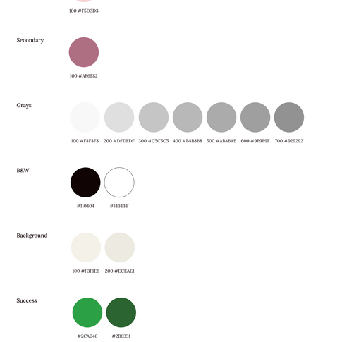
In regards to the visual design, I used the same typography and colors that I created for the bistro's original website. My visual design goal was to mimic the bistro's website look and feel for the online ordering website so users would trust the online ordering site and feel more comfortable placing an order (according to my research).


THESE WERE SOME MAJOR LEARNINGS OR POINTS I WANTED TO CALL OUT
Maze and Useberry
I learned how to use Maze and Useberry. These two usability testing tools really helped me because I improved my unmoderated usability tests. I was able to receive better user feedback on my designs, which helped me improve my lo-fi prototypes.
Framer
I learned how to use Framer and I was able to improve my hi-fi prototyping skills. Now I understand why people use Framer - these advanced prototyping tools can provide users with a more realistic experience. If Figma could add some of these Framer features then that would be awesome.

