Restaurant Management System
Creating a mini RMS for the bistro
THE PROBLEM
The ordering and reservation process needed to be improved because the process was slow. Servers were writing down their orders on paper and then hustling over to the kitchen to give the kitchen staff the order, and the owner and manager were writing down reservations on paper.
I went ahead and planned out how I would create this mini Restaurant Management System (RMS). I decided not to replace the credit card machine or cash register because that would be too costly.
MAKE OF THE TEAM
Me
KEY GOAL
Create a mini RMS to improve the ordering and reservation process
MY ROLE
UX/UI Designer
TITLE OF THE CALLOUT BLOCK
THE SOLUTION
After 3 months, I finished my design and the owner and manager were happy with the look and function of the POS and KDS. The servers and kitchen staff found the system interesting and are keen to use it. However, due to budgetary constraints, the owner decided to hold off on implementing this new system.
RESEARCH
I did some research on tablets and settled on a 10" Android tablet because they are affordable and easier to read than a phone. I researched several sites to get visual design ideas and to better understand how to create a POS and KDS.
BREAKING DOWN THE PROCESS
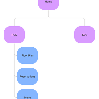
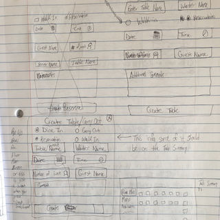
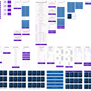
After my research, I created a sitemap, sketched a paper wireframe, made a lo-fi prototype and began designing the hi-fi prototype of the POS and KDS.
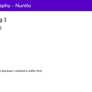
After my lo-fi prototype, I began thinking about the typography and colors for the RMS. I decided to use Nunito for my typeface because I wanted something that was soft and easy to read (maintaining the bistro's brand a little bit).
My color inspiration came from the Frank & Betsie's logo - specifically, the purple grapes. I didn't want the RMS to look identical to the website, but I wanted to maintain the feminine vibe that the bistro has. A white background was more appropriate than a black color for the system because a black background would be too harsh.


THESE WERE SOME MAJOR LEARNINGS OR POINTS I WANTED TO CALL OUT
Figma Variants
This project forced me to create multiple components that needed to be changed quickly. Therefore, I was able to get better with variants and create "on" and "off" switches which sped up my design process. Variants sure are a useful feature!
8pt Grid
For this project, I decided to use an 8 point grid. I wasn't sure how to create a proper column grid for this (something I need to work on in the future) so I decided to stick with an 8pt grid so I can get better at using it.


